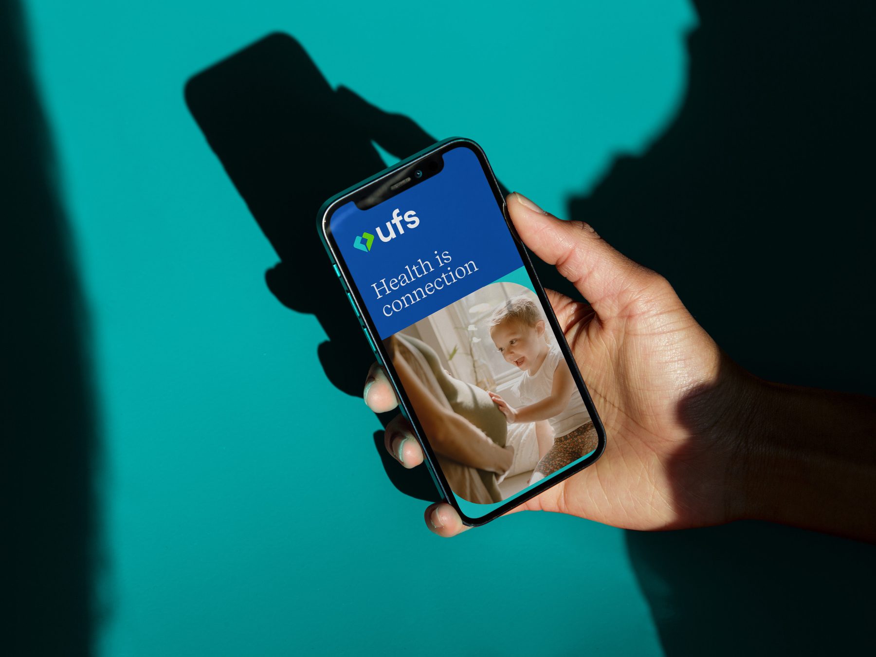
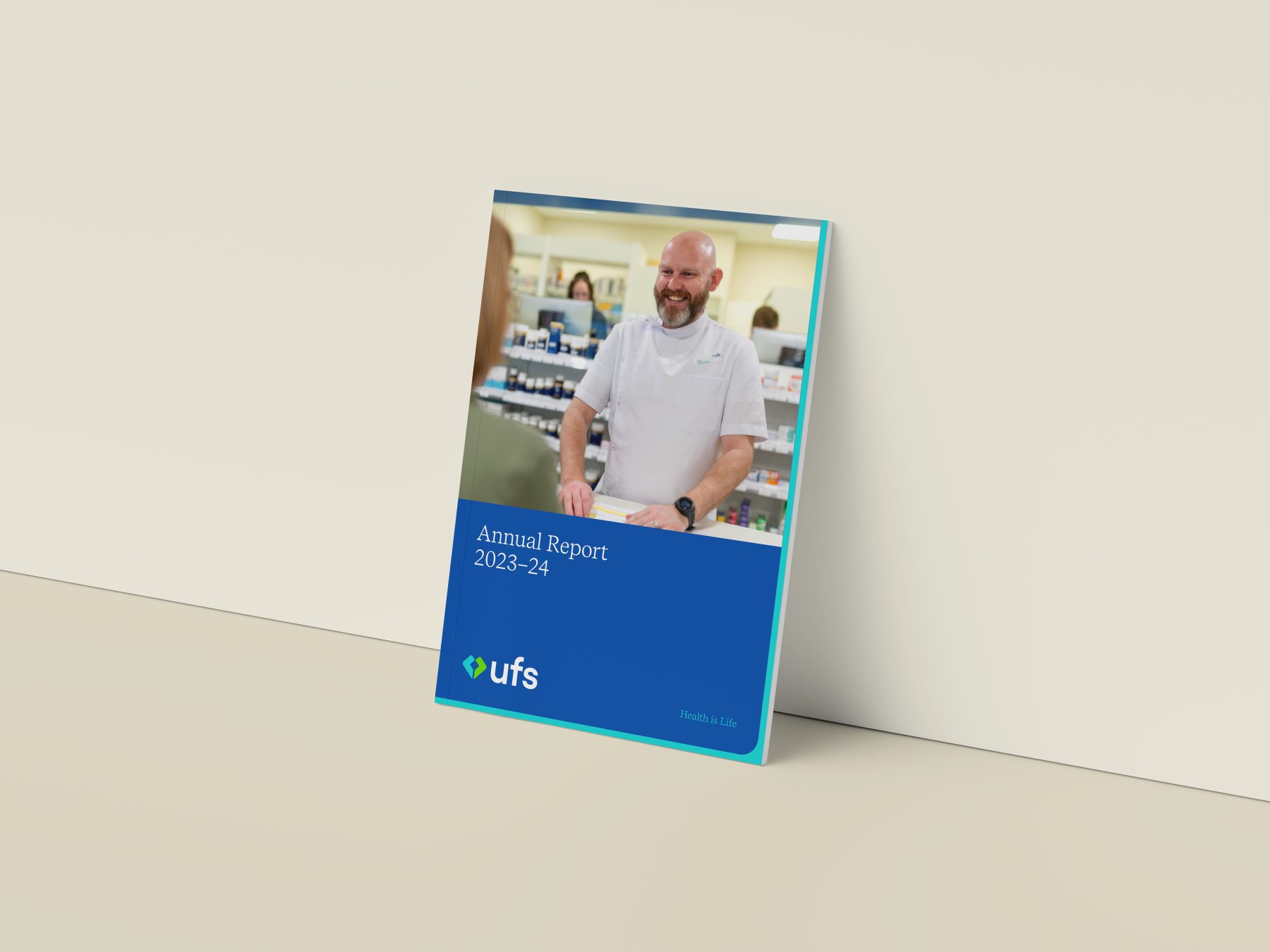
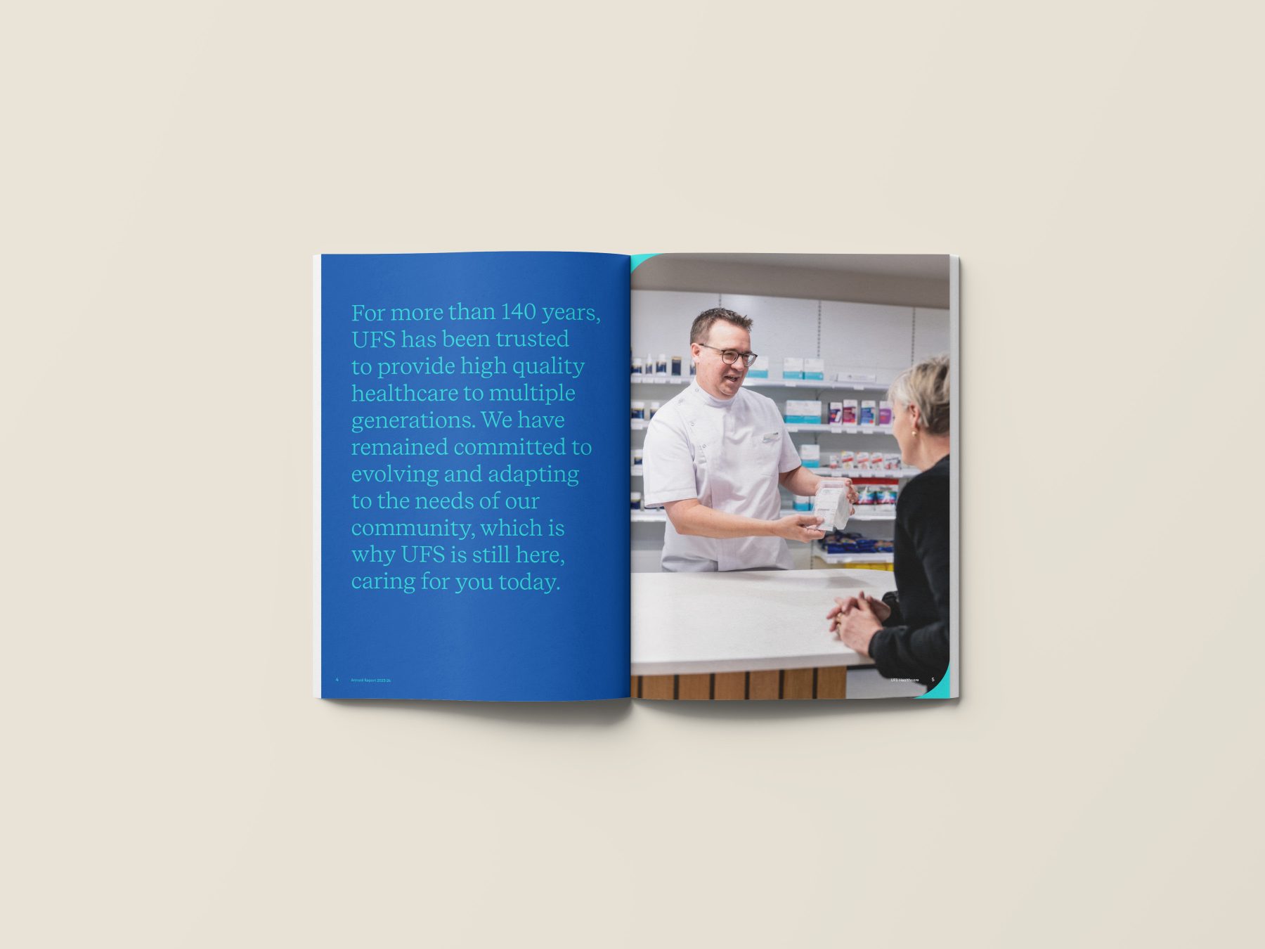
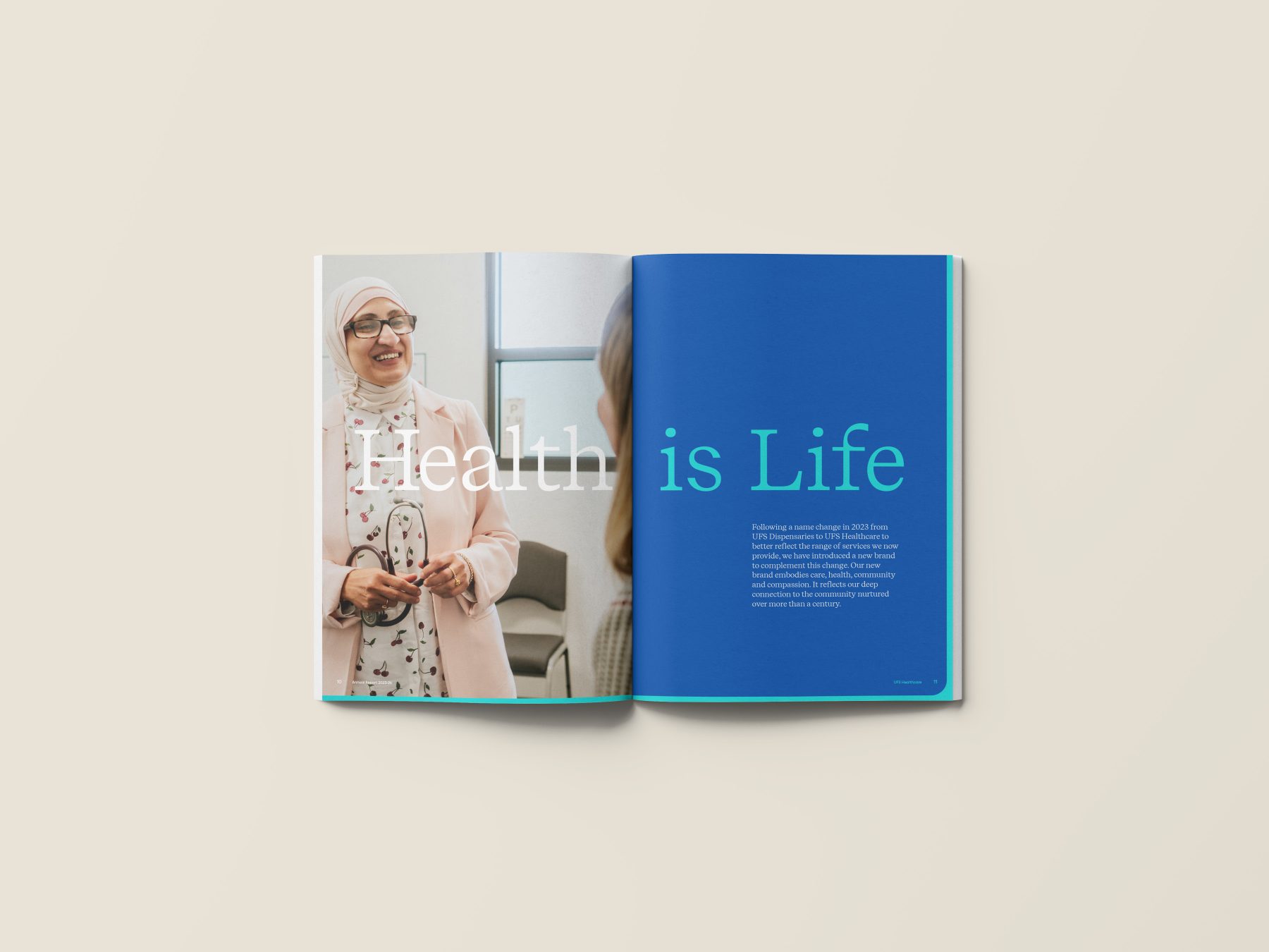
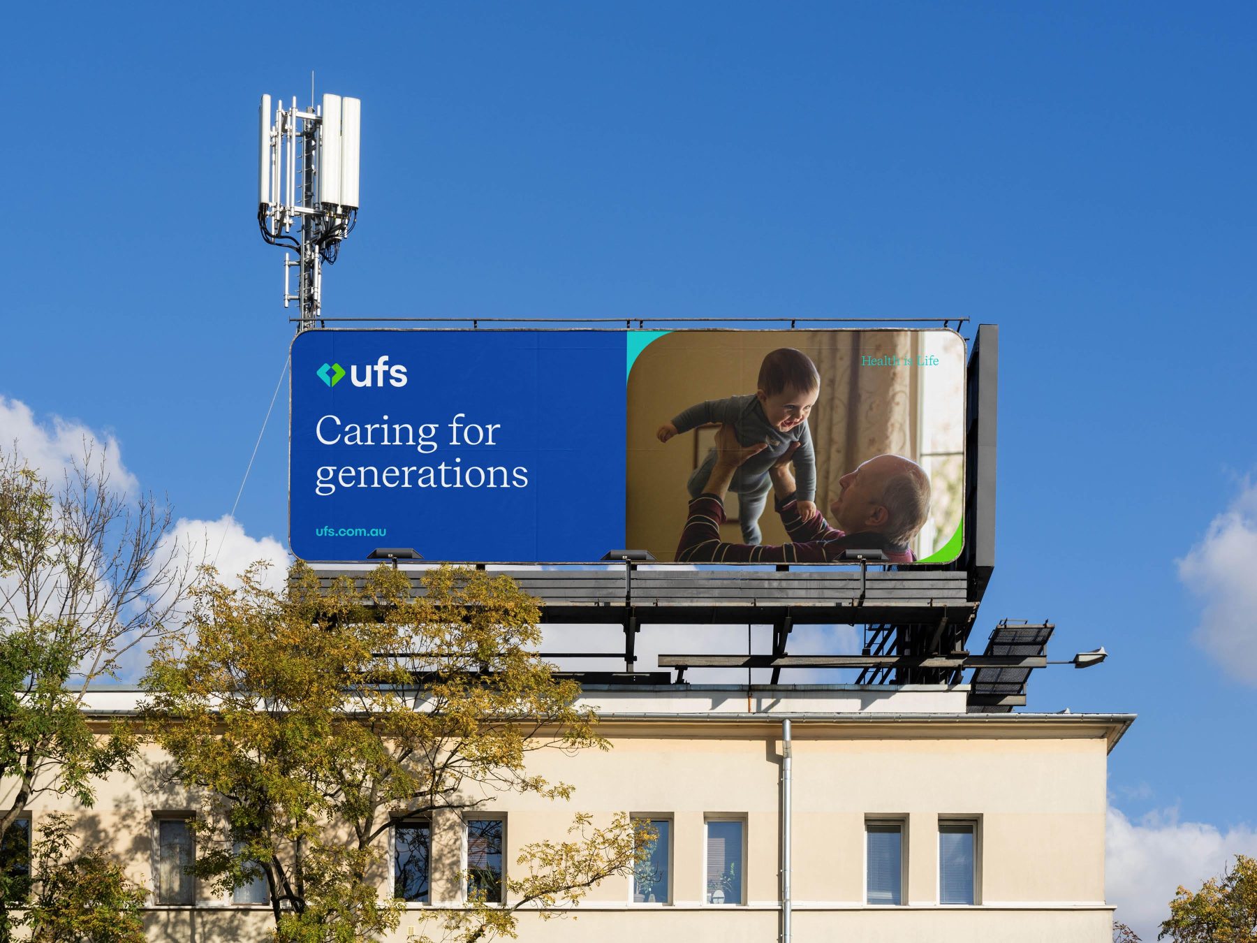
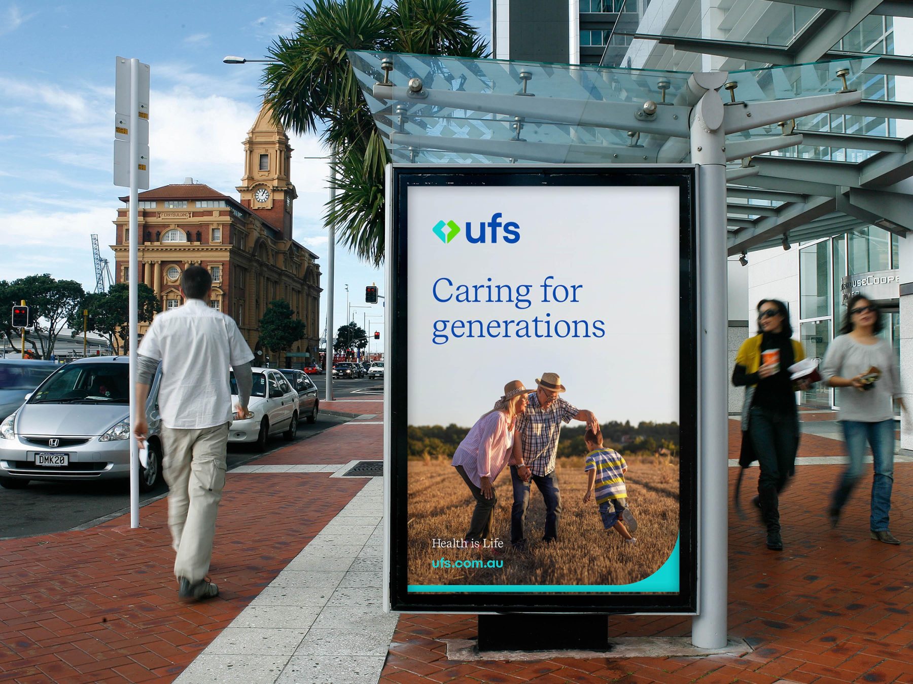
For more than 140 years, UFS has been trusted to provide high quality healthcare to multiple generations in the western region of Victoria. The rebrand began with a name change from UFS Dispensaries to UFS Healthcare, to better reflect the range of services they provide which now includes 19 pharmacies, three medical centres and multiple optometrists.
Working with brand strategist Abby Johnston we were tasked with creating a brand that propels UFS forward; ignites pride, inspires progress, and accelerates impact. We had to avoid the category obsession with what healthcare is, and instead focus on why health matters. What’s lacking in healthcare is a feeling, not a feature. A true sense of the enormity of it all. That your health, is your life. UFS exists to empower more people to live longer, healthier lives.
The UFS brand identity is inspired by their guiding principles and strategic brand positioning – Health is Life – reinforcing the notions of care, community, health, and life. It reflects their deep connection to the community nurtured over more than a century. At the core of the new symbol lies an abstract heart shape symbolising health and care, with two merging shapes creating the image of hands in a nurturing gesture.
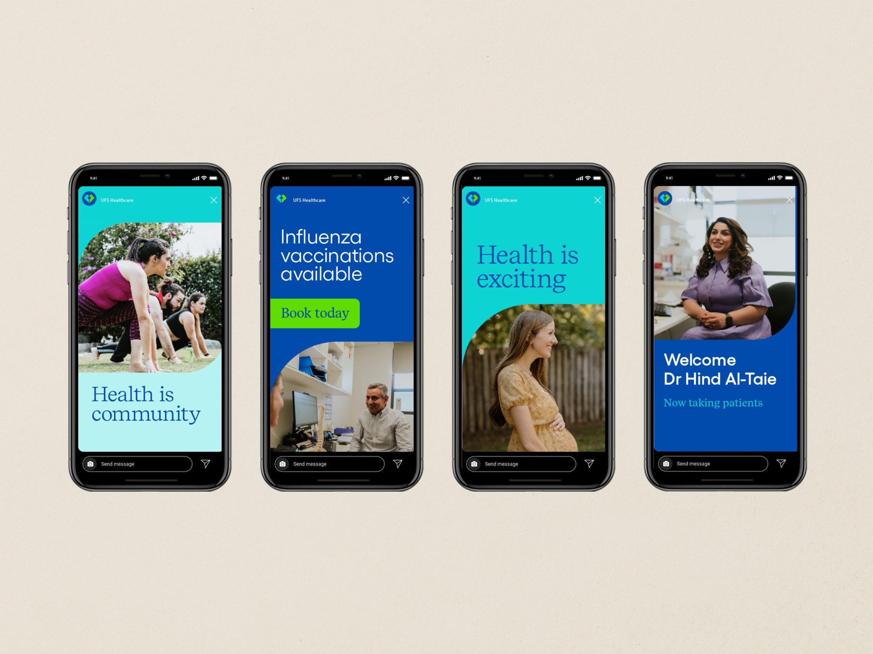
Subtle elements and aspects from the logo extend to our broader visual language. Graphic curves frame our images and backgrounds, strategically positioned to reinforce their commitment to care. A simple line at the foundation of our communications is a nod to life’s journey, with UFS being there every step of the way.
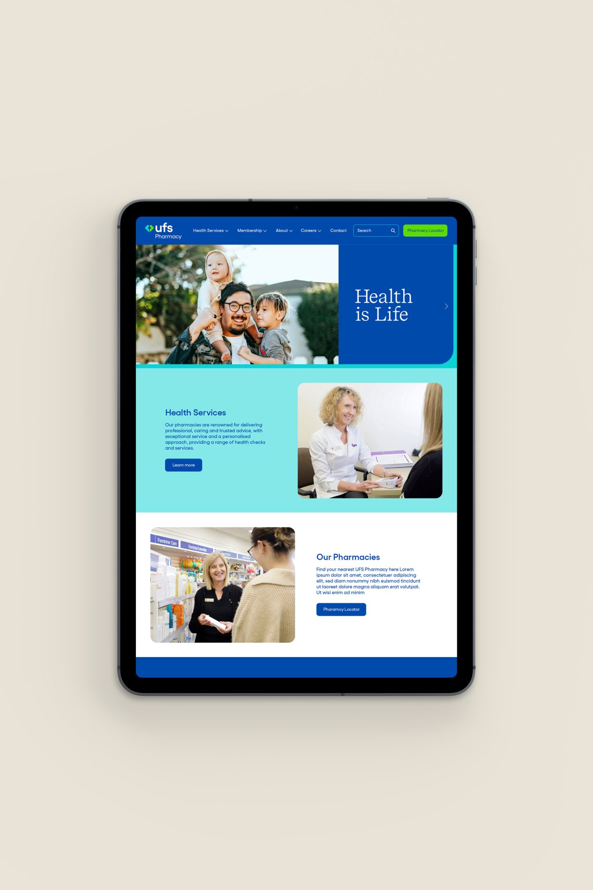
The brand rollout spanned across all UFS pharmacies, medical centres and optometrists which includes new internal and external signage, updated staff uniforms, websites, Annual Report and many other elements.
UFS wanted to create a brand that would propel UFS forward, it needed to be contemporary and relevant whilst still paying respect to their heritage and the important role UFS has in the local community. UFS CEO Matt Vagg believes they achieved this, and feels this brand better reflects who they are and what they stand for today.


